Commerce Craft Theme Documentation
Welcome to the official documentation for your Commerce Craft theme! This guide provides all the essential information you need to set up, customize, and manage your theme effectively. Whether you're a developer or a marketer, you'll find step-by-step instructions and tips to help you create stunning and functional websites.

Enable J-Query
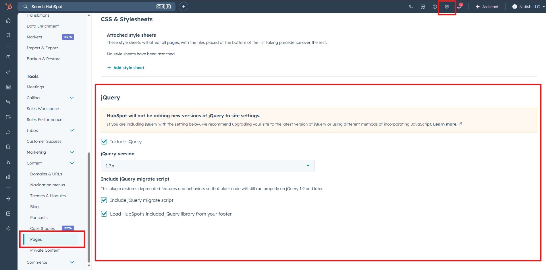
Enabling the jQuery library is important for the Commerce Craft theme, as it supports certain JavaScript functionalities and allows you to write jQuery-based code within the theme.
THEME SETTINGS
The official HubSpot Theme Settings documentation provides a comprehensive guide for configuring theme settings effectively.
MODULE SETTINGS

Product with Filters (Pro Version)
Please note: To show product in Product with Filter first create product in HubSpot click here or click here to know more.
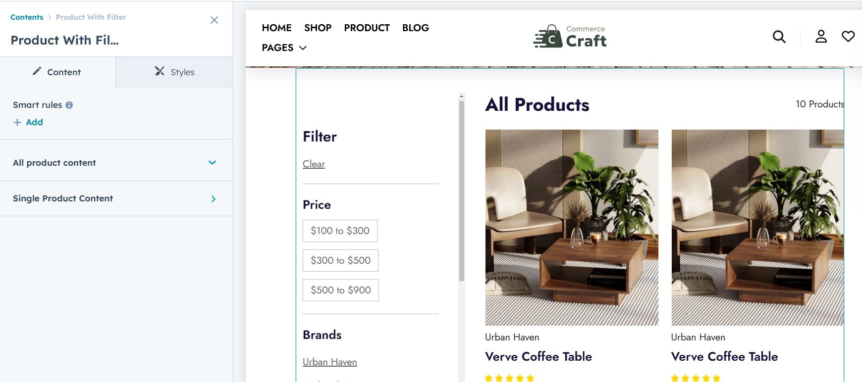
The Product with Filter module allows you to display products with dynamic filters, similar to a faceted search. You can customize the following style settings and content setting for your shop page:
Content settings:
Single product content: Here you can customize or add payment icons, social icons and content in rich-text.
All product content: Here you can enable or disable product filters and set the product per pagination.
Style setting:
1. Spacing
- Item Spacing: Control the vertical spacing between individual accordion items for a clean layout.
2. Social links text color
- This settings if for single product social icon text color.

Testimonial Slider
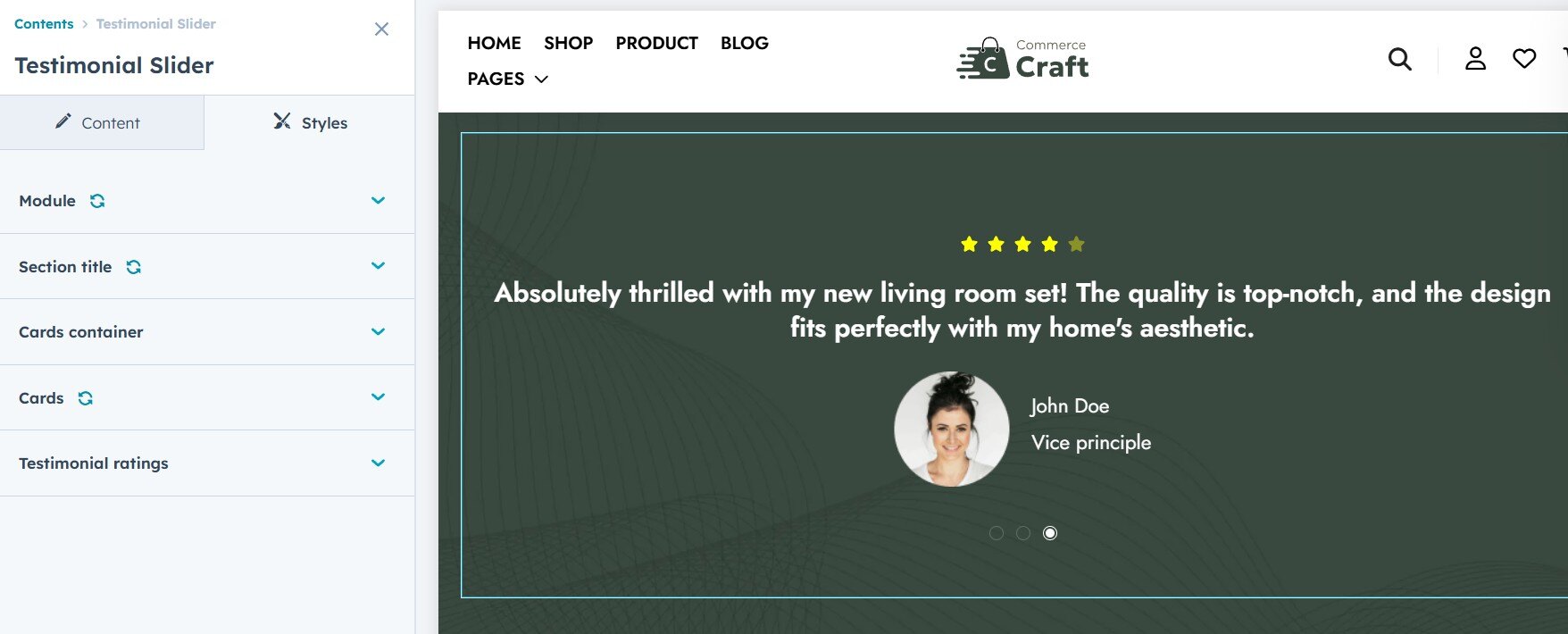
The Testimonial Slider module in HubSpot allows you to display customer reviews in a dynamic, interactive format. You can customize the following style settings for your testimonial slider:
1. Background and Text Color
- Header Background Color: Change the background color of the accordion header for better visual appeal.
- Text Color: Customize the text color in the accordion header for readability and contrast.
- Icon Color: Adjust the color of the expand/collapse icon for visibility and design consistency.
2. Text Alignment & Spacing
- Adjust the font size of the accordion header to fit the overall typography of your site.
3. Font
- Add your desire font style such as color, font family.
4. Card Style (Grid or Slider)
- Choose between a grid layout (static display of testimonials) or a slider layout (dynamic, scrollable testimonials) based on your preferred design and functionality.
3. Ratings Icon and Color Options
- Ratings Icon: Customize the appearance of the star or icon used to represent ratings. You can choose different icons or styles.
- Ratings Color: Adjust the color of the rating icons to make them stand out or match your site's color scheme.

Accordion
The Accordion module in HubSpot allows for collapsible content sections, and its style settings can be customized to match your design needs. The following options are available for styling:
1. Color Settings
- Header Background Color: Change the background color of the accordion header for better visual appeal.
- Text Color: Customize the text color in the accordion header for readability and contrast.
- Icon Color: Adjust the color of the expand/collapse icon for visibility and design consistency.
2. Heading Size
- Adjust the font size of the accordion header to fit the overall typography of your site.
3. Spacing
- Item Spacing: Control the vertical spacing between individual accordion items for a clean layout.

Image Grid
The Image Grid module in HubSpot allows you to display images in a grid layout with customizable style settings to match your site's design. The following settings are available:
1. Text and Background Color
- Text Color: Customize the color of the text in each grid item to ensure readability and visual appeal. Background Color: Adjust the background color of the grid item or the entire grid to align with your branding.
2. Spacing
- Control the space between the grid items to create a well-balanced layout. Adjust the padding and margin to ensure a clean and organized look.
3. Card-Column
- Adjust the number of columns in the image grid. You can select the number of columns per row to control the grid layout, making it responsive and visually appealing.
4. Button Style
- Primary or Secondary Button: Choose whether to style the buttons within the grid as primary (more prominent) or secondary (subtle) to match the overall design of your site.
Cards With Icon
The Cards with Icon module in HubSpot allows you to display content in a card format, each featuring an icon. You can customize the following style settings to match your site's design:
1. Text and Background Color
- Text Color: Customize the color of the text in each grid item to ensure readability and visual appeal. Background Color: Adjust the background color of the grid item or the entire grid to align with your branding.
2. Spacing
- Adjust the padding and margin around the cards to control the space between them and create a clean, organized layout.
3. Card-Column
- Adjust the number of columns in the card grid to control the layout of the cards. You can select how many columns to display per row, ensuring the design is responsive and visually appealing. This module also supports a slider option, allowing you to display the cards in a horizontal scrollable layout for a more dynamic and space-efficient display, especially on mobile and smaller screens.
4. Icon Style (Left to Right)
- Customize the position of the icon relative to the text. Choose whether the icon appears to the left or right of the heading or content for a more intuitive design.
3. Corner Radius
- Control the corner radius of the cards to create rounded corners for a more modern, softer look.

Product Slider
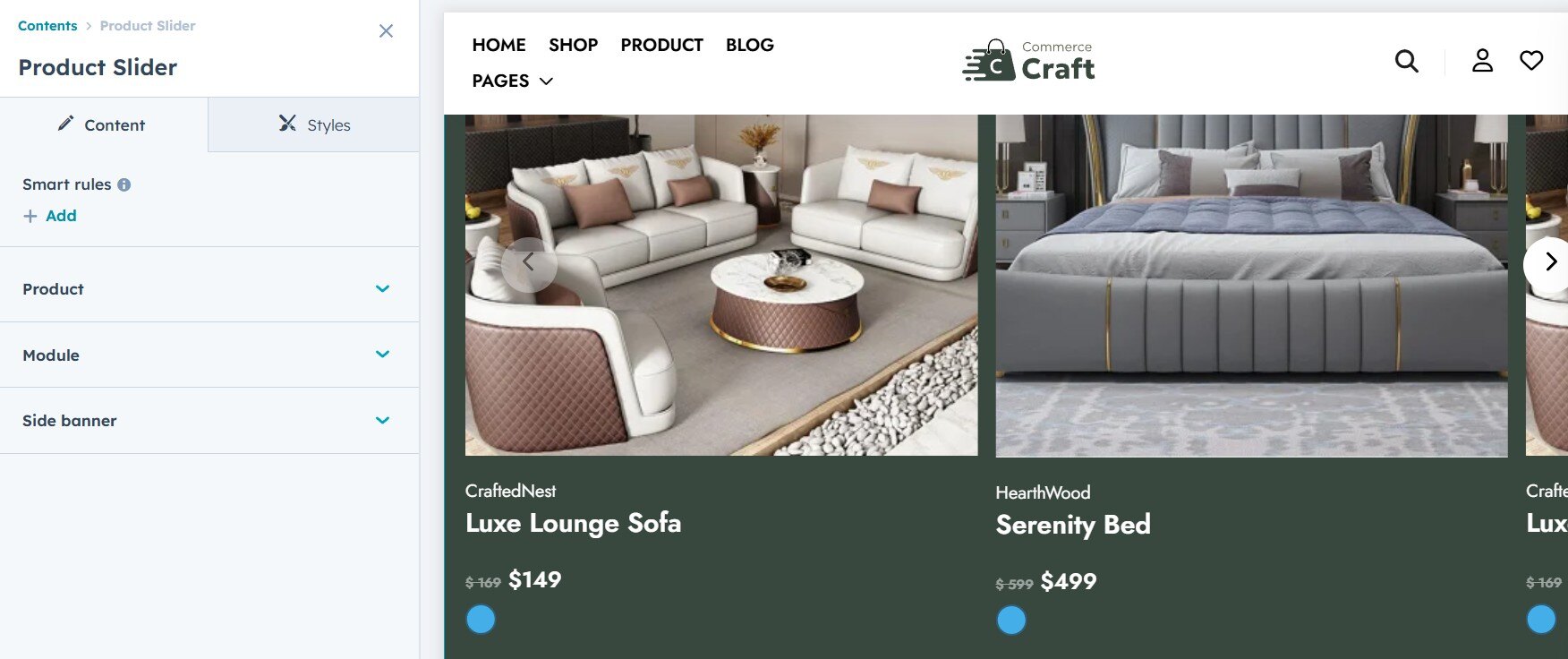
The Product Slider module in HubSpot lets you create a dynamic, interactive display of products. You can add content such as images, names, prices, and buttons. The following style settings are available to customize the appearance of your product slider:
Please note: Before adding product in Product slider module first create product in HubSpot Click here to know more.
1. Slide Banner Featured
- Add a Featured Image to each product slide for a visual showcase.
- Include Content on each slide to highlight important product details.
- Add a Button that links to product pages or additional information.
2. Show Options
- Tag: Display a product tag (e.g., "Sale," "New," etc.) to give users quick insights
- Name: Show the product name on the slide for easy identification.
- Price: Display the price of the product prominently.
- Color: Showcase the available color options for the product.
3. Arrow Icons
- Customize the arrow icons that navigate through the product slider. You can choose from different styles and sizes to match your design.
4. Icon Style (Left to Right)
- Customize the position of the icon relative to the text. Choose whether the icon appears to the left or right of the heading or content for a more intuitive design.
5. Corner Radius
- Control the corner radius of the cards to create rounded corners for a more modern, softer look.
6. Text and Background Color
- Text Color: Customize the color of the text in each grid item to ensure readability and visual appeal. Background Color: Adjust the background color of the grid item or the entire grid to align with your branding.